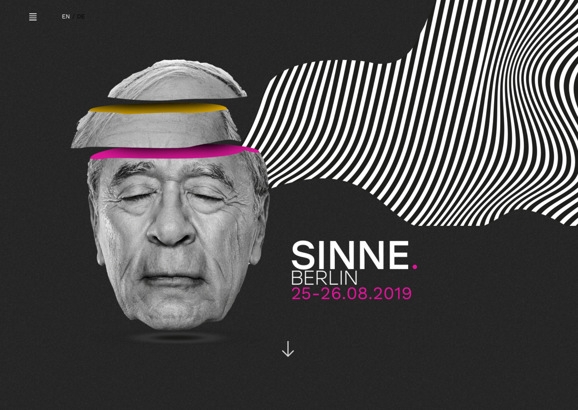
SINNE.
RESPONSIVE MUSIC FESTIVAL WEBSITE: UX / UI / BRANDING / GRAPHIC DESIGN
I was tasked with conceptualising a brand new music festival. The main goal was to create a strong visual brand identity and a responsive website creating an engaging, impactful and well-designed experience for the users
RESEARCH
Music festivals all over the world have soared in popularity over the last decade, indicating a global appetite for unique experiences in the music industry. According to Pollstar, 2017’s top 100 tours yielded a record breaking $5.65 billion in revenue and nearly 16% increase over 2016. With a vast range of festivals offering genre diversity, they require more than just booking top tier talent. Music fanatics have raised their expectations to find more innovative experiences whether through art, food, atmosphere and/or culture.
Regardless of trending artists booked, developing a sustainable brand “experience” in conjunction with digital marketing strategies are key to a festival’s survival. Festival branding must adapt across a vast range, from large scale stage visuals / way finding, to digital ticketing systems and of course online promotion and content.
However, branding a festival goes beyond creating a logo, a colour palette and a collection of photography — it’s about creating a holistic identity built around more abstract and experiential concepts.
Today, designers have more at their arsenal in creating experiences and showcasing an event even before it happens.
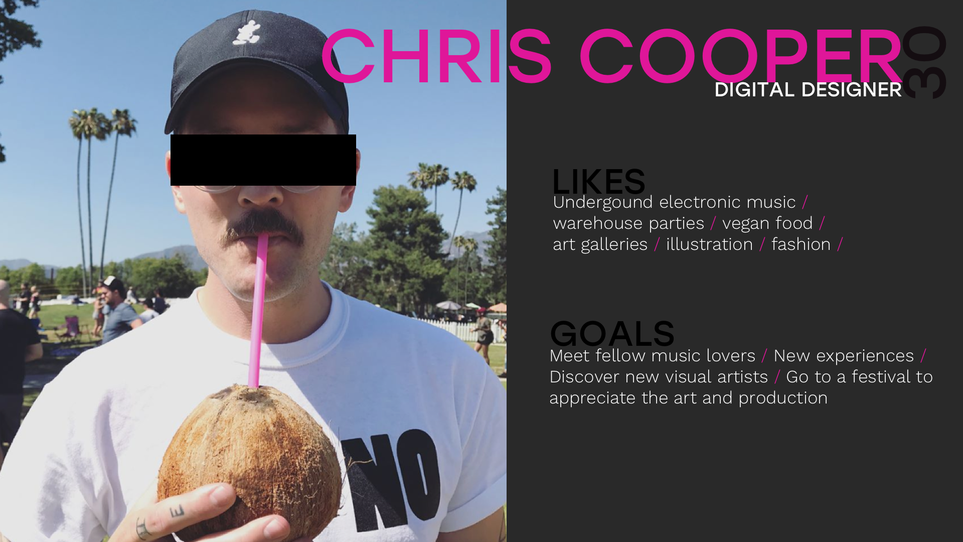
PERSONA
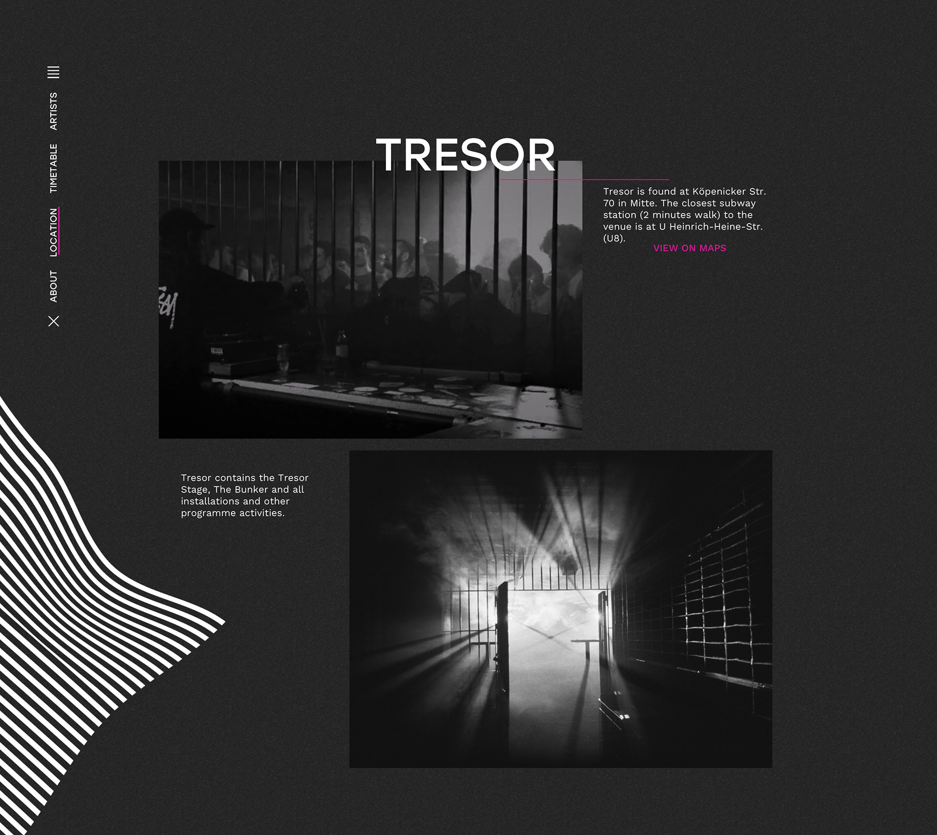
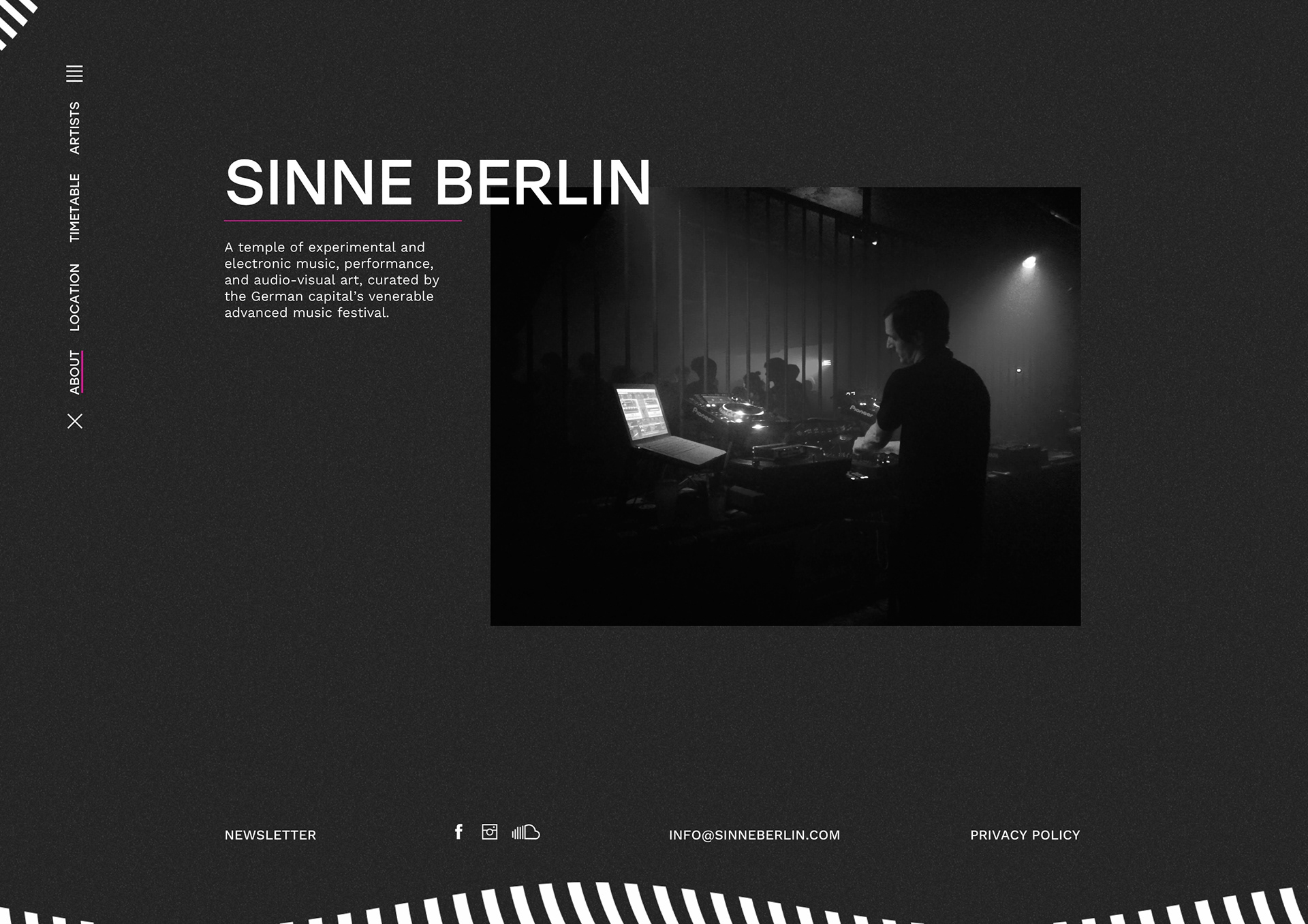
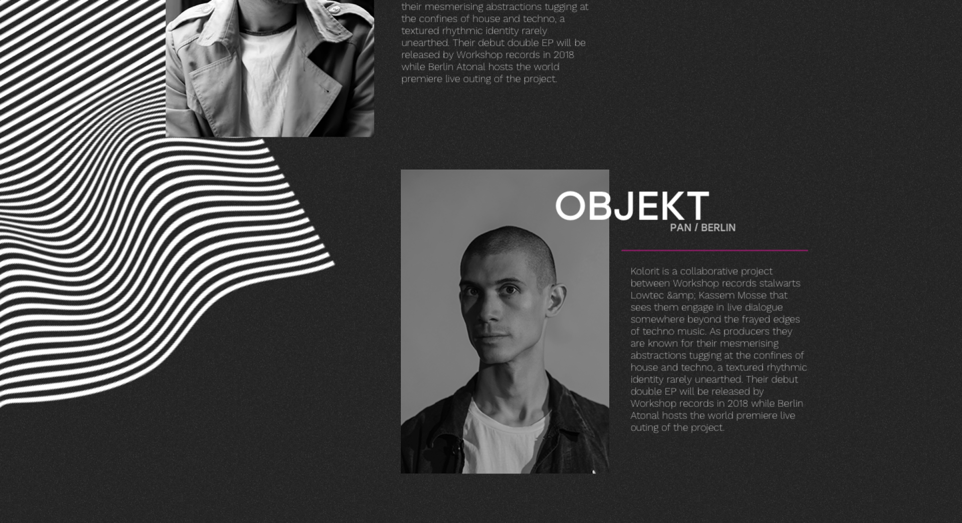
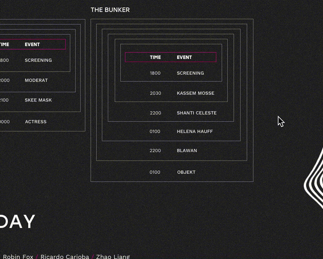
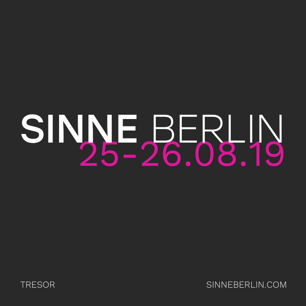
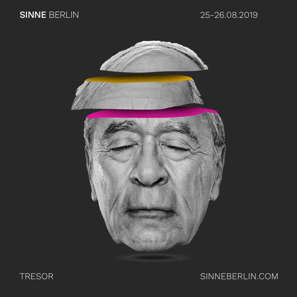
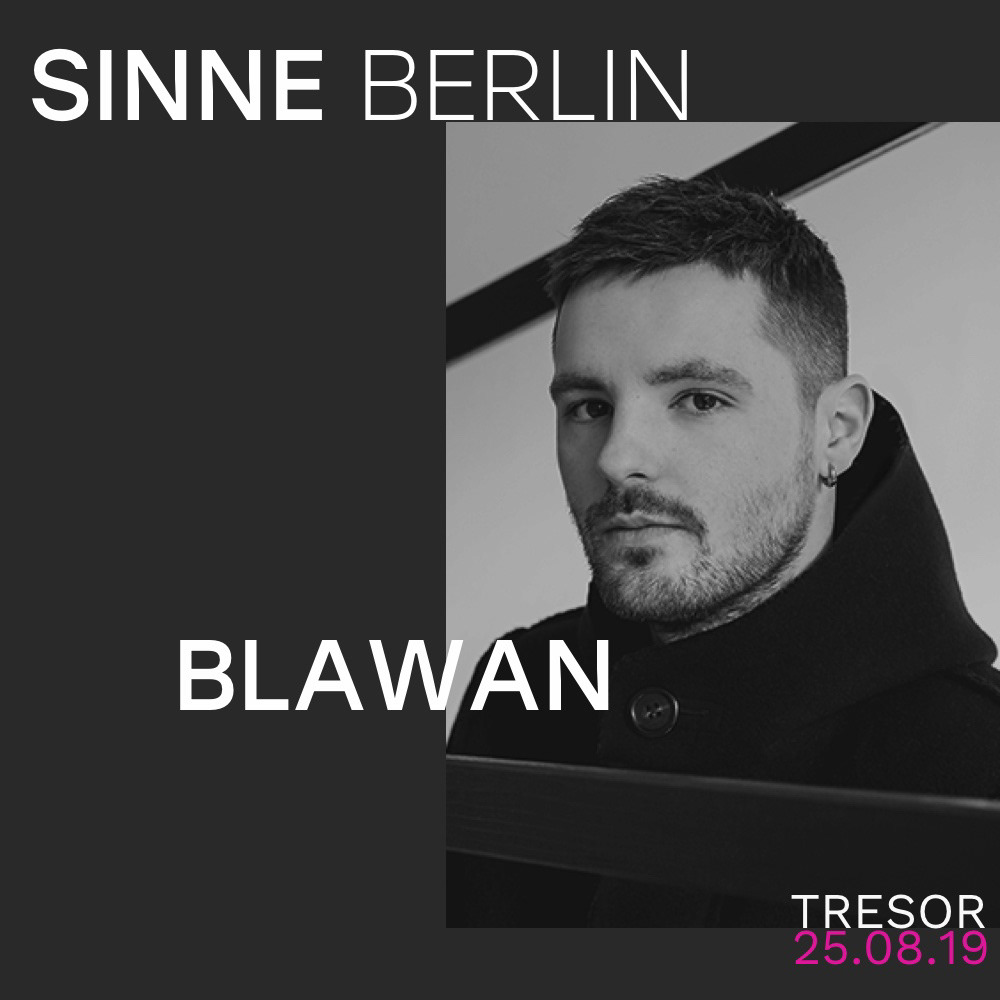
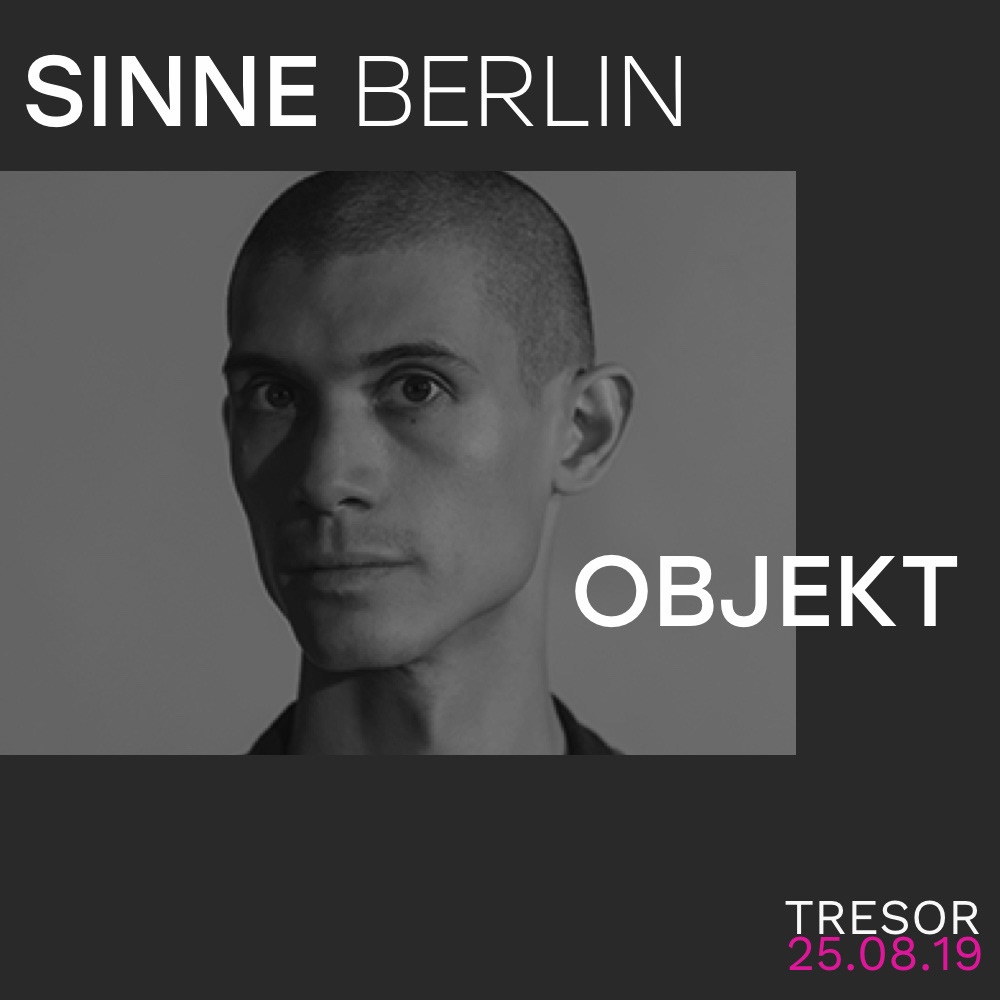
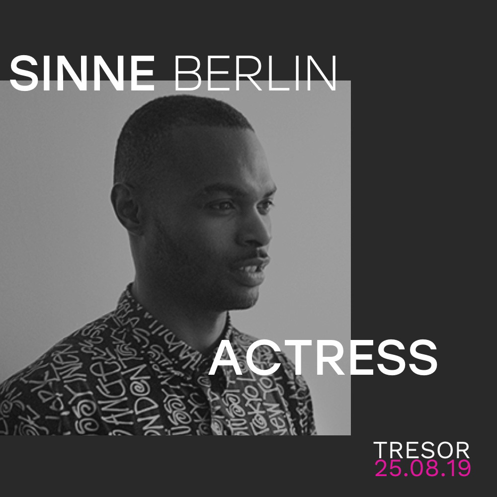
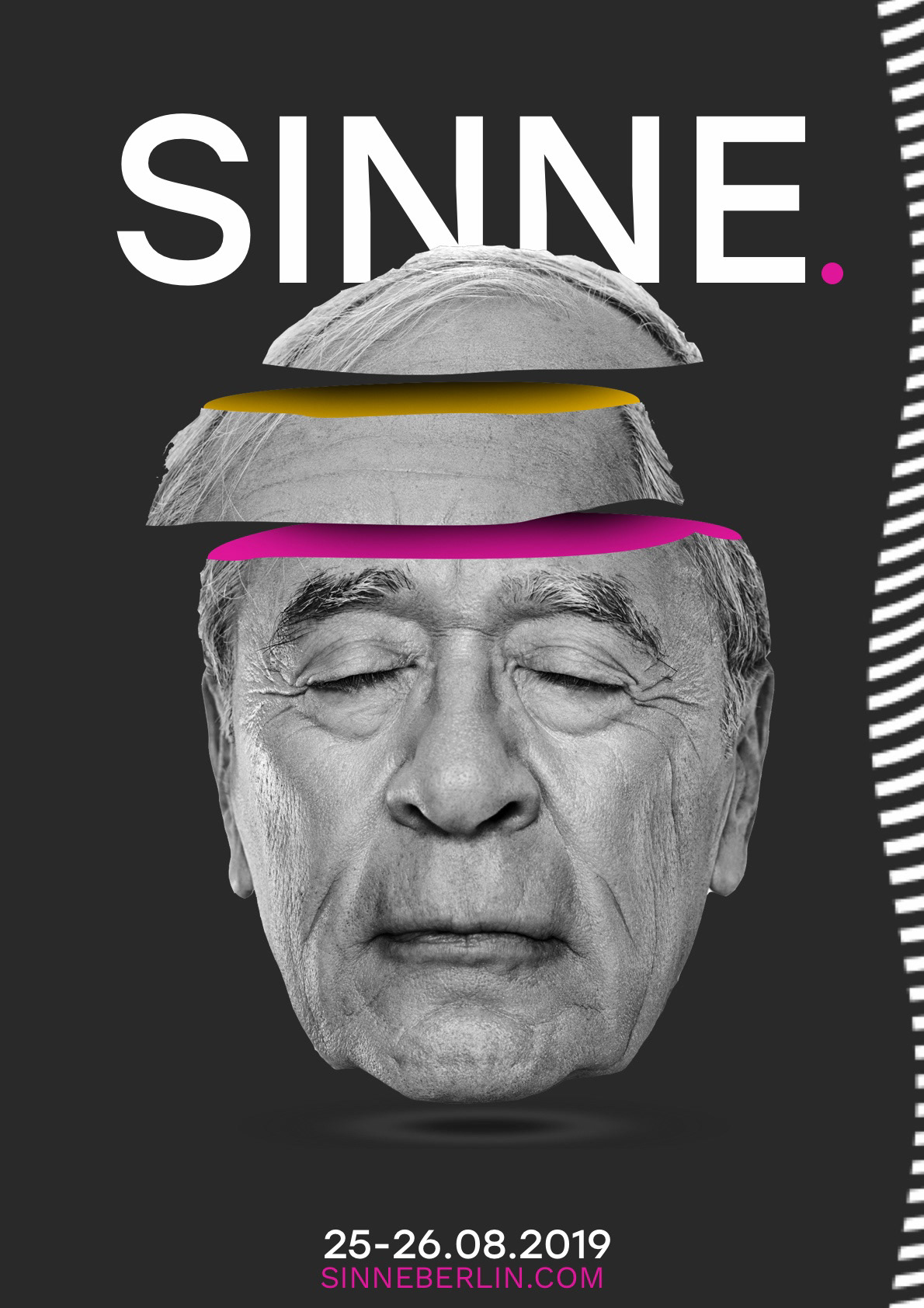
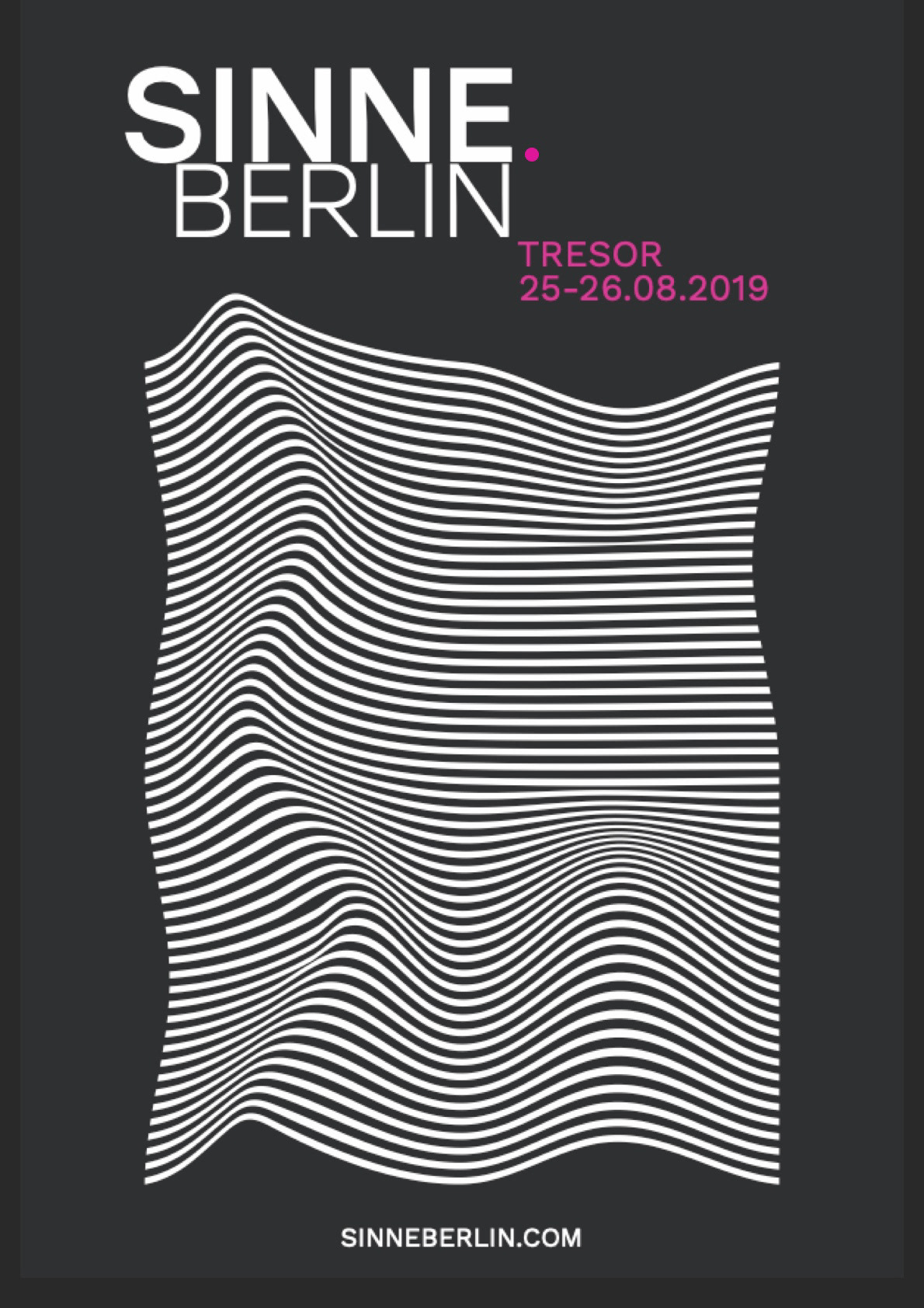
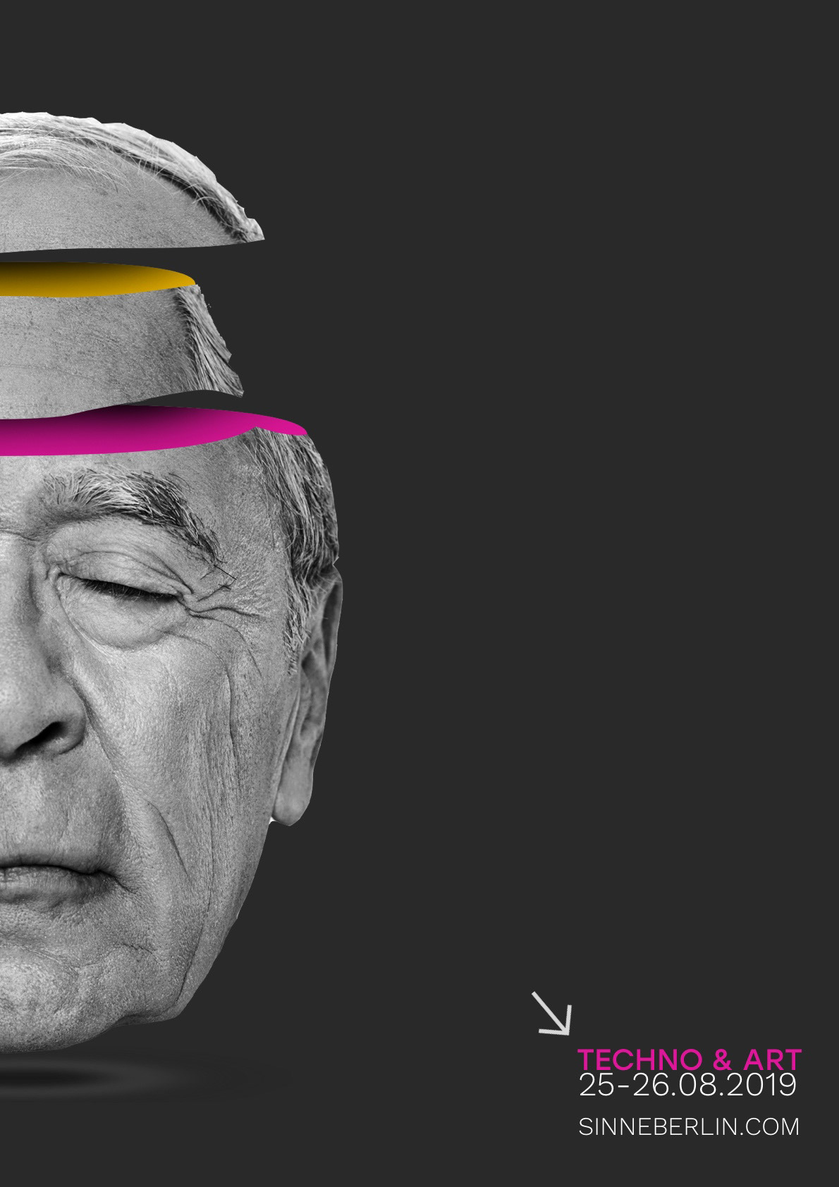
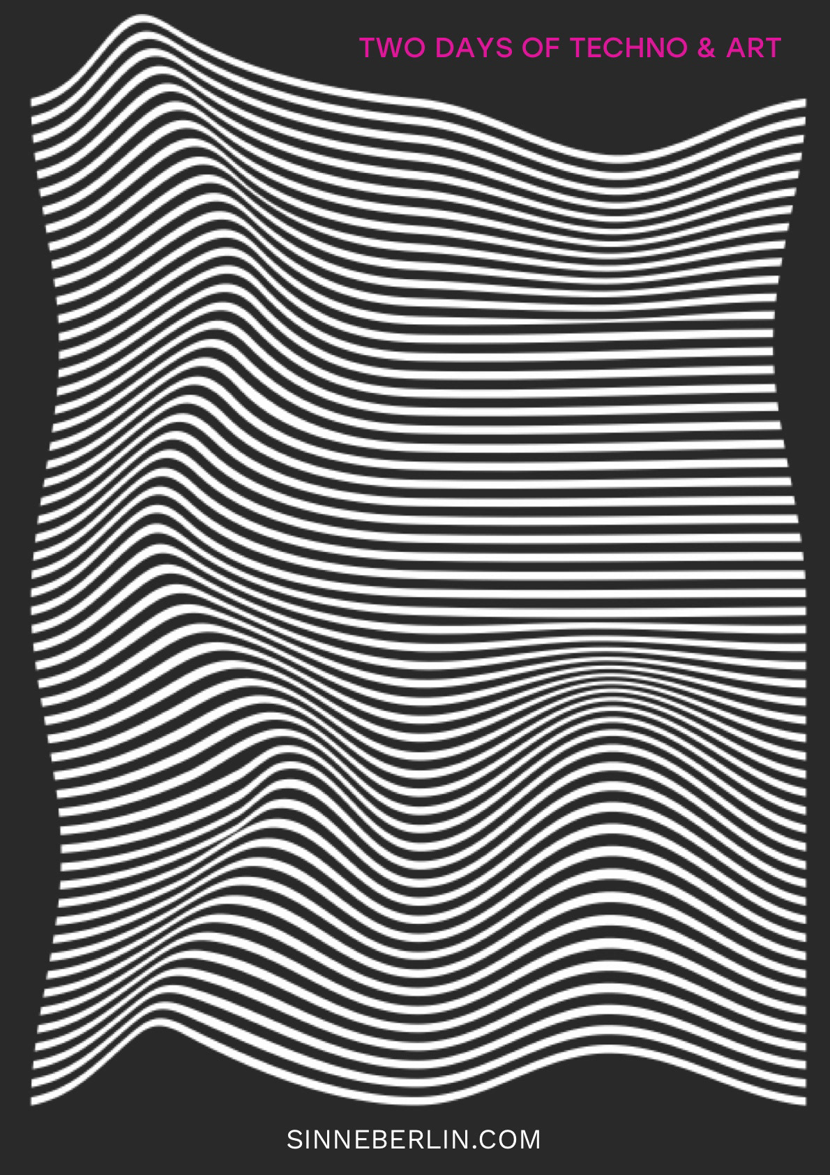
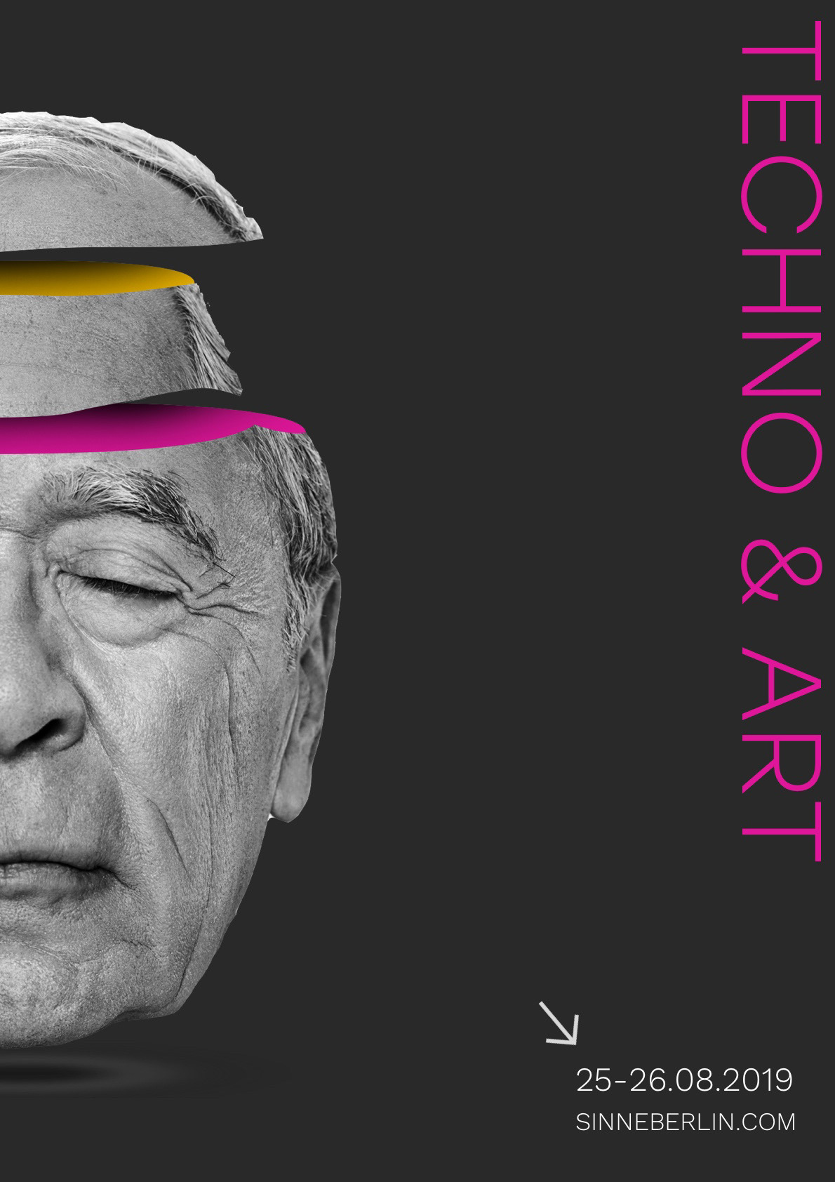
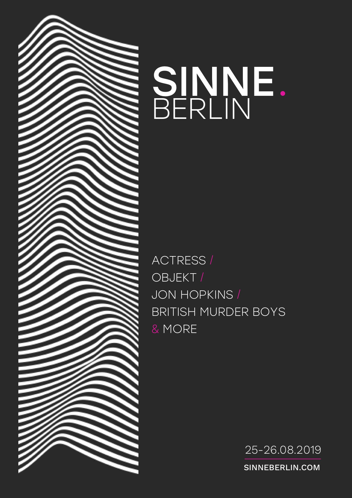
Sinne means ‘senses’ in German. SINNE. Berlin is a carefully curated techno music & visual art festival designed to elevate the senses. It spans 2 nights and is located in Berlin, Germany. The musical and visual artists selected for the festival are known for being experimental and pushing the boundaries of convention. It is set in the iconic nightclub Tresor, which is a huge, old power plant. The festival is based in Berlin — a hub for techno.
Based on desk and field research on the type of people who would attend the festival, I came up with a persona to keep at the forefront of the design work.
MOOD BOARD

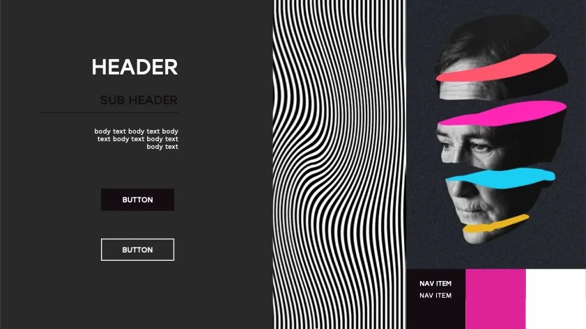
STYLE TILE
To help choose the design direction, I created a style tile to see how the moodboard could be transalated into a functional UI.
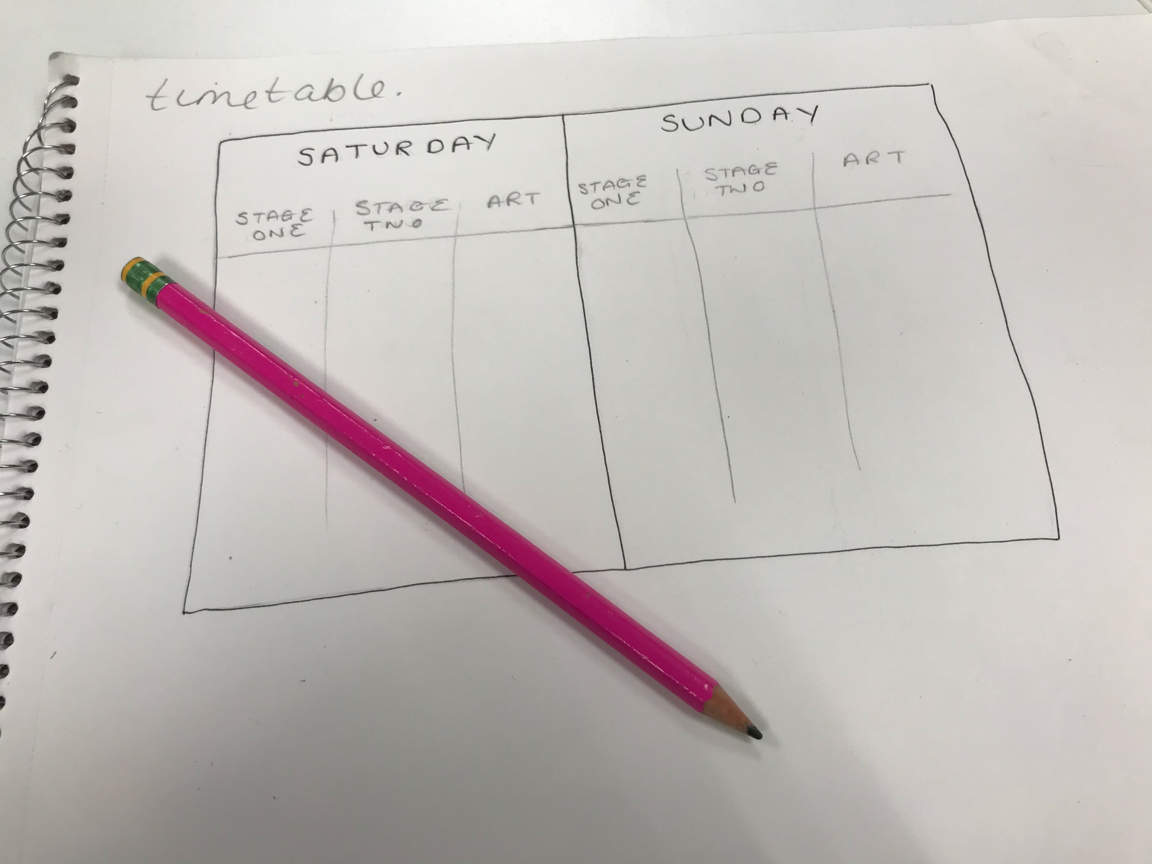
PROCESS

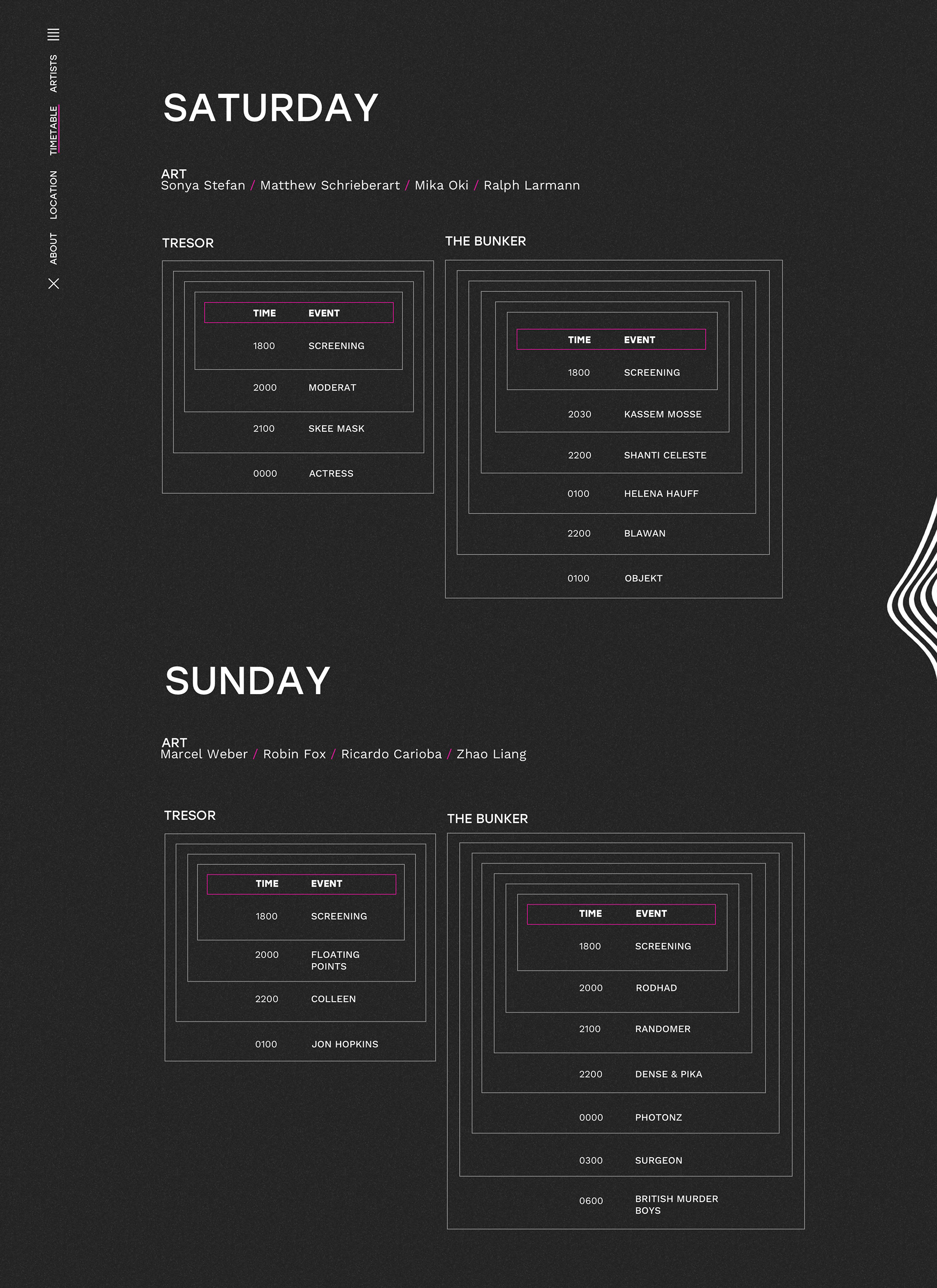
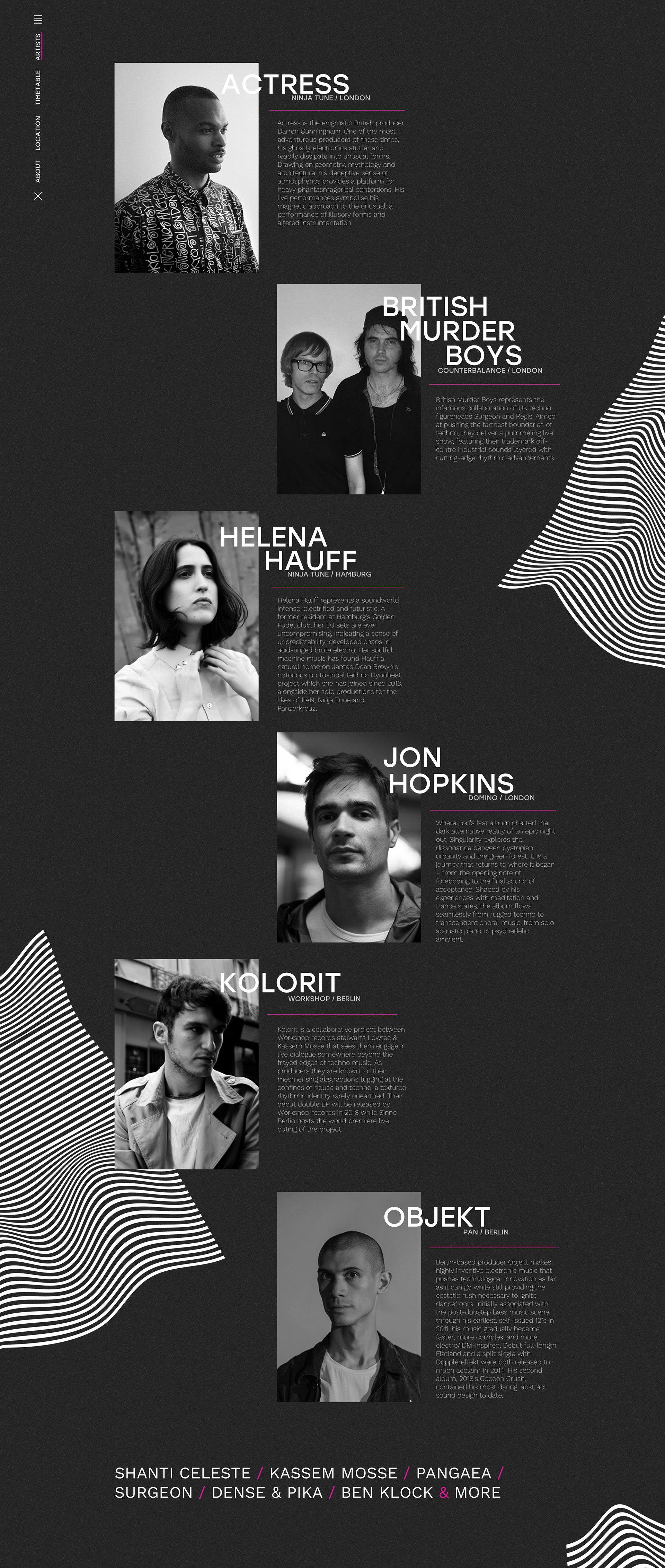
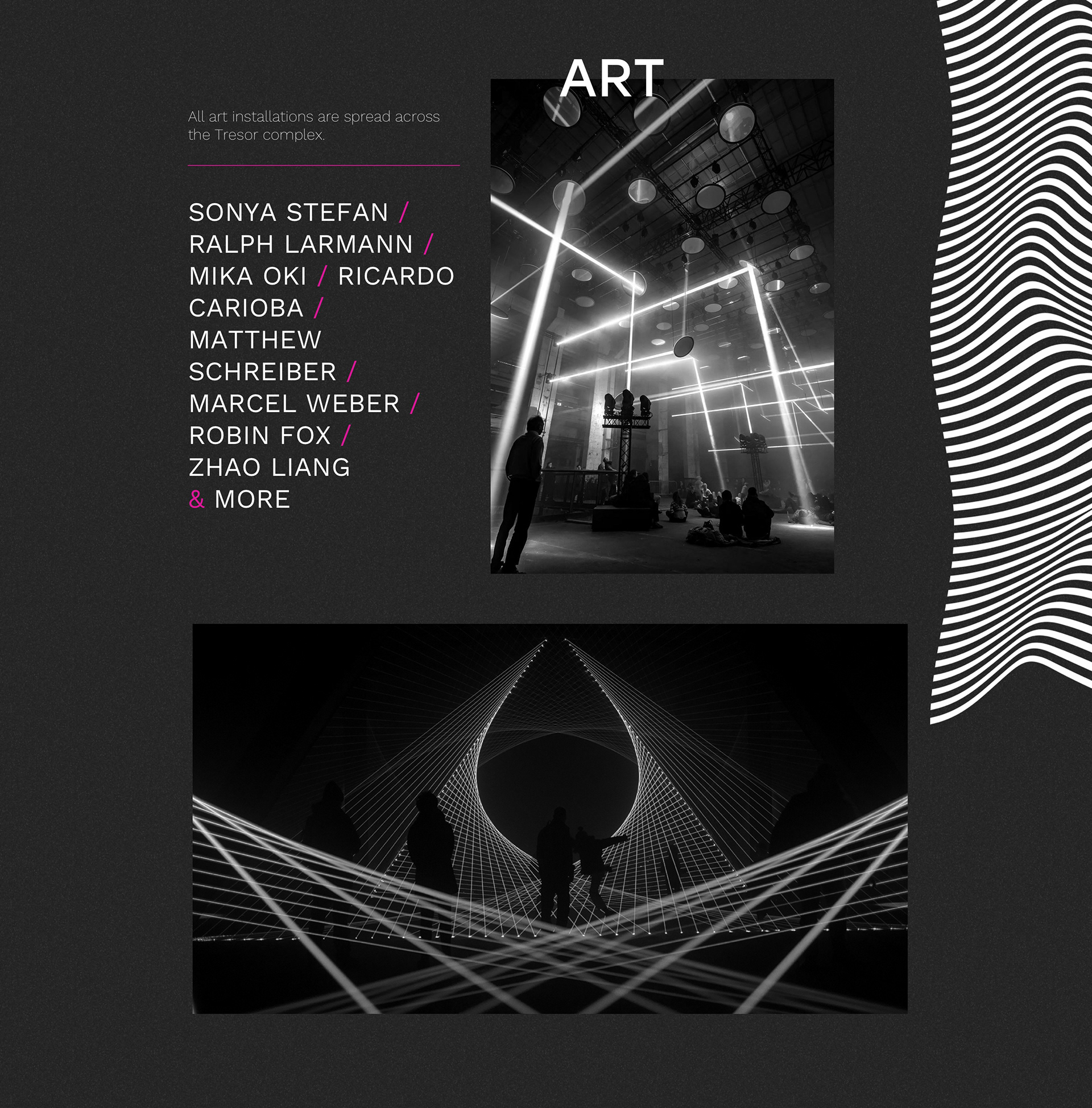
FINAL DESIGN
ANIMATIONS

MARKETING CAMPAIGN
SINNE. Berlin only wants to speak to the target audience who are familiar with the music scene and are used to finding events through DJs, artists or clubs they follow. This means the campaign is never persuasive, just informative yet stylish.
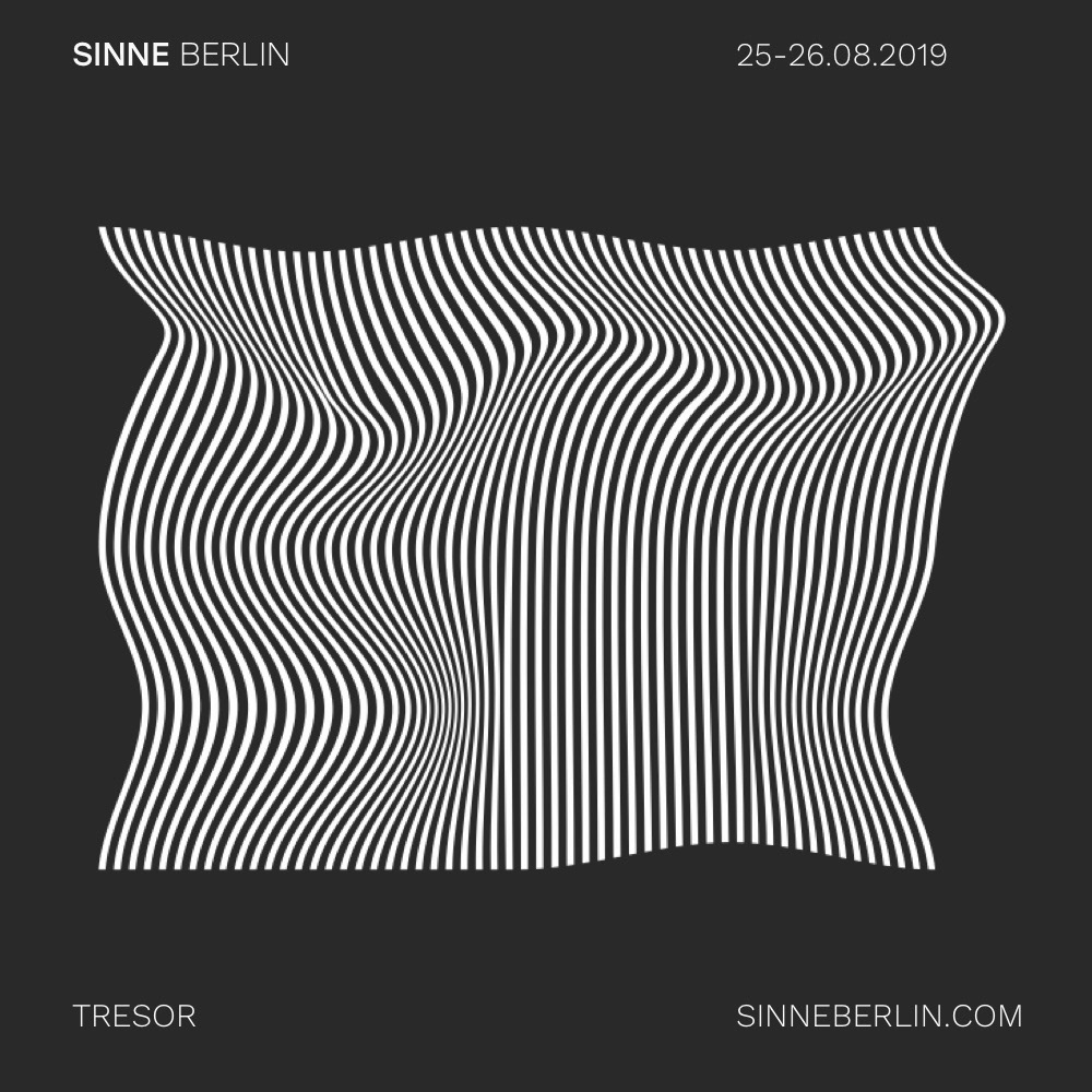
INSTAGRAM


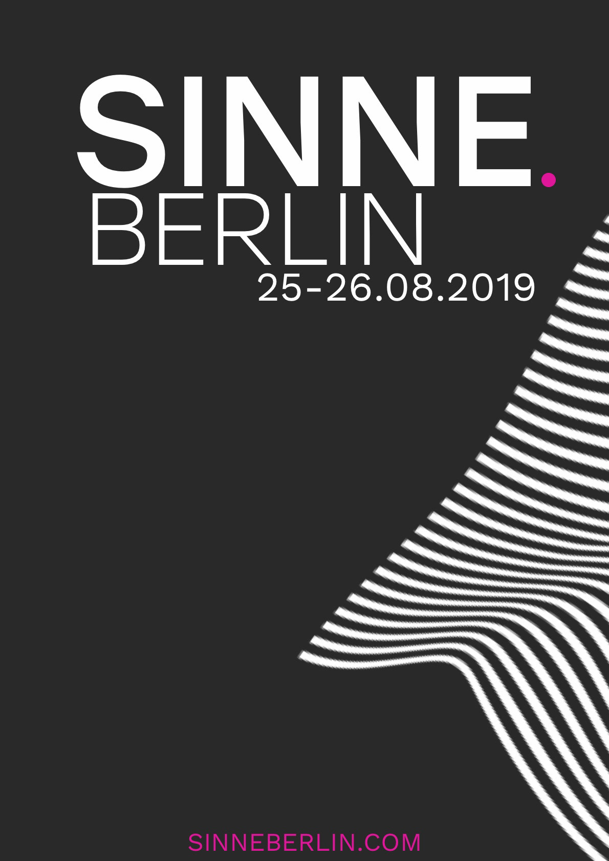
POSTERS


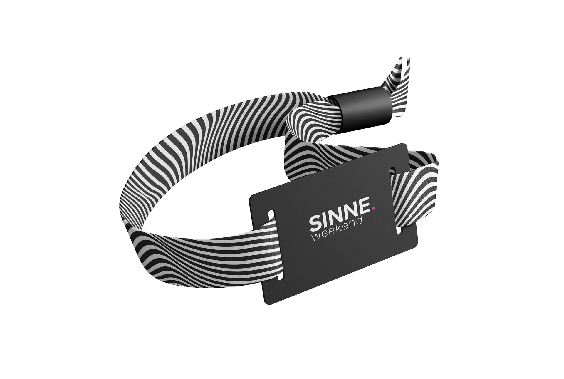
WRISTBANDS


KOOTH SIGN-UP FLOW.
RESPONSIVE MENTAL WELLBEING WEBSITE: UX/UI
Kooth is an online wellbeing platform for young people. Their mission: "to create a welcoming space for effective personalised digital mental heath care. Available to all." Kooth want their service available to all but currently this is not the case, so I was tasked with making the start of the user journey - the sign-up flow - more inclusive. There were many limitations and unique considerations which made designing this flow a challenge.
WHO
Kooth is used by young people aged between 11 and 18 who are suffering from mental health issues. As the users may be in a heightened sense of distress, it is important the design and language are mindful of this.
PROCESS


AN ACCESSIBLE DESIGN SYSTEM
There was not an existing design system at Kooth, so this was a great opportunity to build one which was accessible and worked with the existing brand.
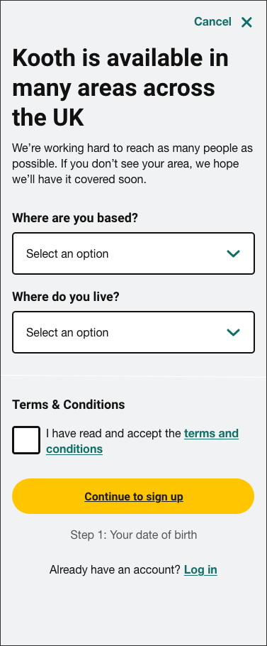
ACCESS TO THE SIGN-UP FLOW
Kooth is only available to those in areas where the local government has paid. The previous sign-up form asked where a user was based, but not all areas in the UK were listed due to this constraint; this created a lot of confusion. The step was amended to make this more clear:
ASKING ABOUT GENDER
In an ideal world, we would not need to ask people for personal information. However, Kooth uses this information to feed into the government Mental Health Services Data Set which is used to help shape their services.
As some users are at the time of their lives where they may be unsure or uncomfortable sharing this information, it was important to be transparent about why this was being asked.
Due to safe-guarding concerns the sign-up form cannot include any open text fields, so the options chosen needed to allow for an ever-evolving gender spectrum.

CAPTURING ETHNICITY
The previous sign-up form used the national standard options which were white-centric and not inclusive. To be truly inclusive the list would have been extremely long, so landing on a set of options without the option to write your own was extremely challenging.
The options that were landed on are by no means perfect, but I felt they were a step in the right direction. User testing also suggested the selection of options made new users feel safe and that Kooth was an inclusive space.

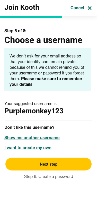
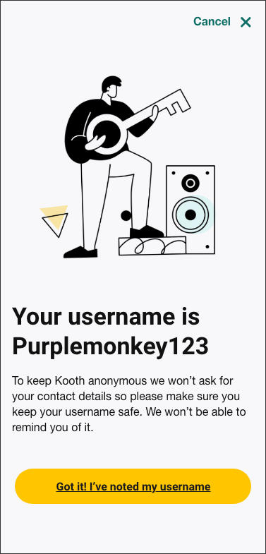
CREATING A USERNAME
When capturing username there are a few limitations that had to be considered. Due to the sensitive nature of the service, usernames cannot be personal, all free text needs to be approved and we cannot take the user's email address. This also means we cannot remind people of their username at a later stage so have to emphasise the importance of remembering it.
The solution was to provide a database of pre-approved usernames but this would need extra emphasis on having to remember it. The option to create your own was kept as back-up for those users who like to express themselves through their online pseudonym.

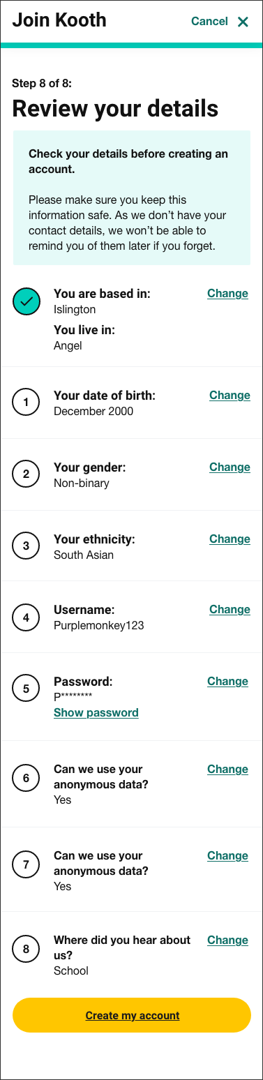
REVIEW DETAILS PAGE
As contact details are not stored Kooth are unable to reminder users of their details or change them later. The introduction of a summary page was designed to help alleviate the number of abandoned accounts.
GRIPABLE.
TABLET APP: UX / UI
The GripAble platform provides engaging rehabilitation activities for people recovering from a wide range of neurological and orthopaedic conditions. Through the app, therapists create personalised training programmes, remotely monitoring physical progress with instant feedback on patient interaction. It’s a digital-meets-real life solution designed to improve remote patient care and treatment outcomes.
WHO
GripAble is used by people recovering from a wide range of neurological and orthopaedic conditions and their therapists.
PROBLEM
We were tasked with expanding the offering of a mobile app across a variety of operating platforms. The aim was to improve access and therapy for a greater number of online patients, while enhancing convenience and ease of use.The app already had an existing brand and very basic design system but working with an external designer had meant the UX/UI had not been approached as a holistic end-to-end experience.
SOLUTION
Each new build of the app gave us the opportunity to improve the design and built out the design system to allow for more flexibilty and consistency whilst keeping it simple. The most impactful change was allowing the pages to be scrollable which gave us a lot more space to make the app feel less busy and provide a pleasant patient experience.
As users would be recovering from varying degrees of hand injuries the design also needed to be accessible with a simple UX and large CTAs.
WIREFRAMES
When presenting functionality and concepts to the client, it was helpful to initially show wireframes so the conversations were more focused. I used wireframes to align on the functionality of a given page then prototypes to demonstrate the user flows and end-to-end experience for each function. Once we had agreed on the UX, we could move to the aesthetic design.

RADIUS EXPLORATION


SAMPLE OF FINAL DESIGNS


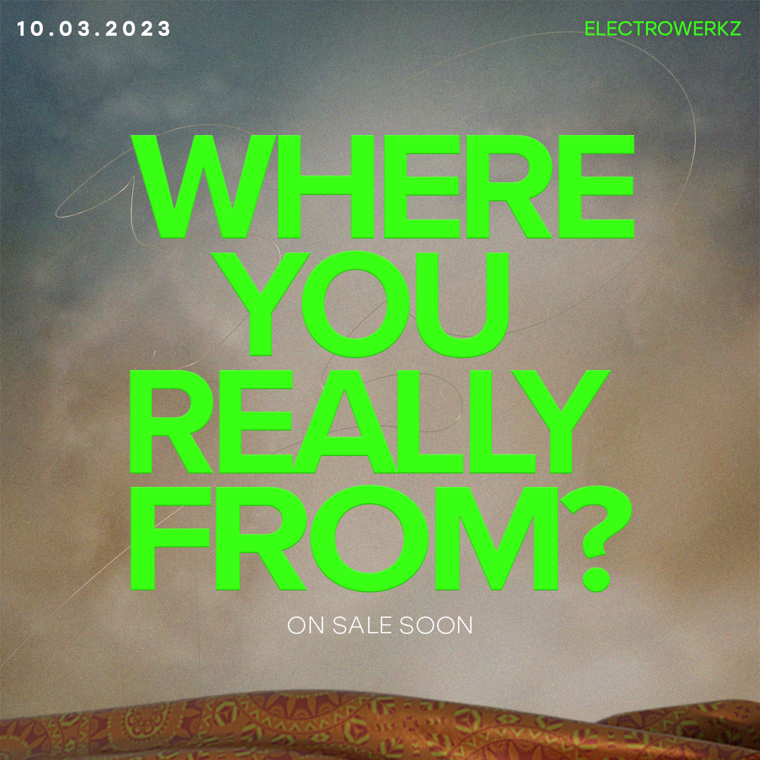
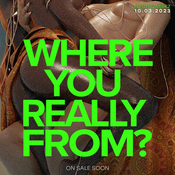
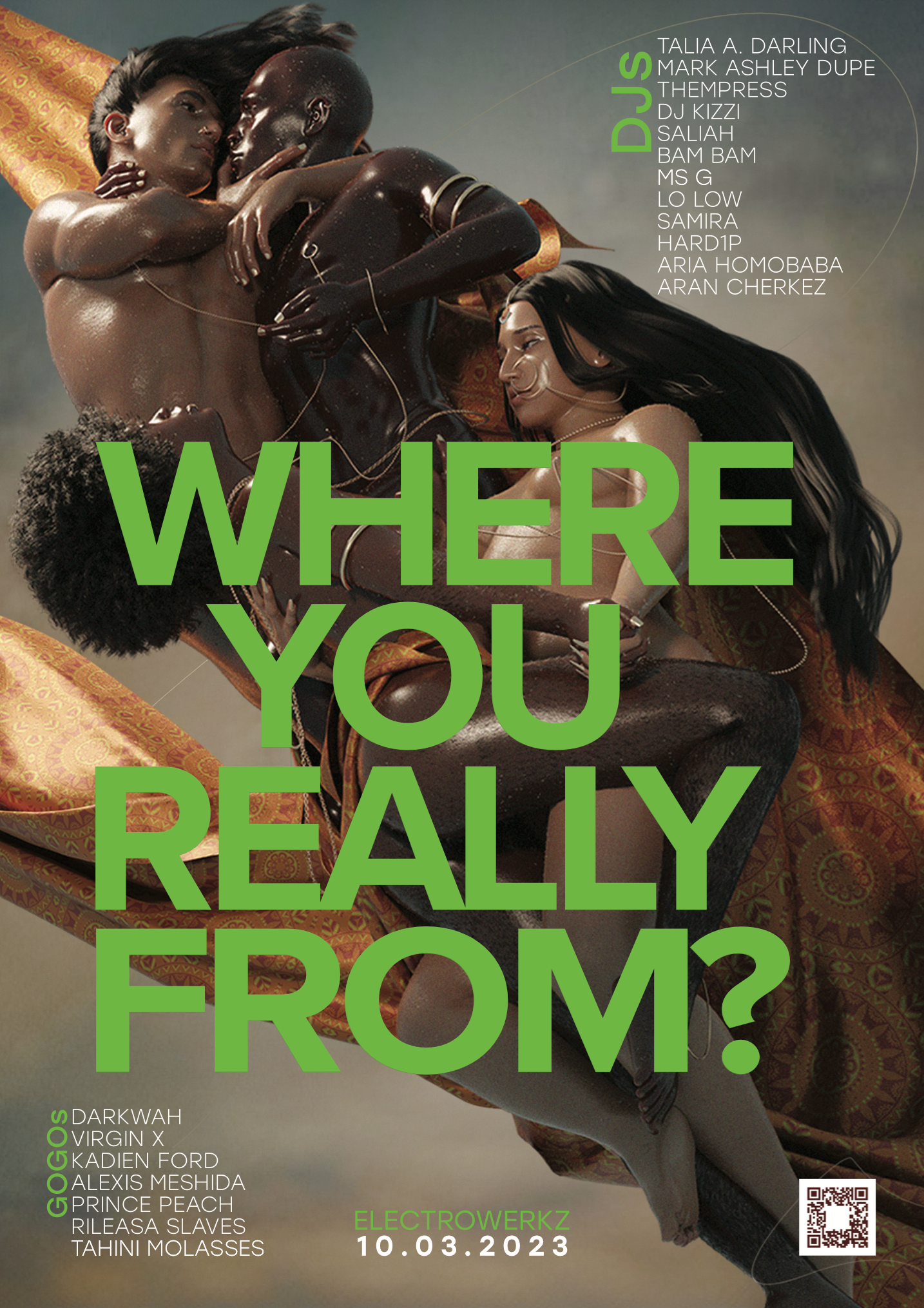
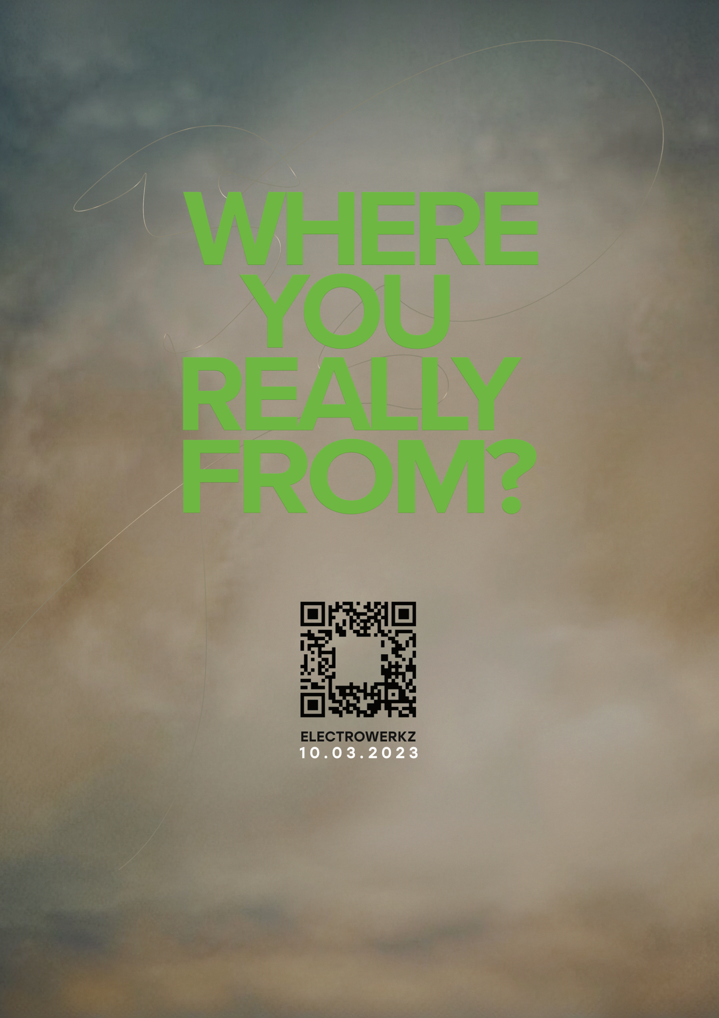
WHERE YOU
REALLY FROM?
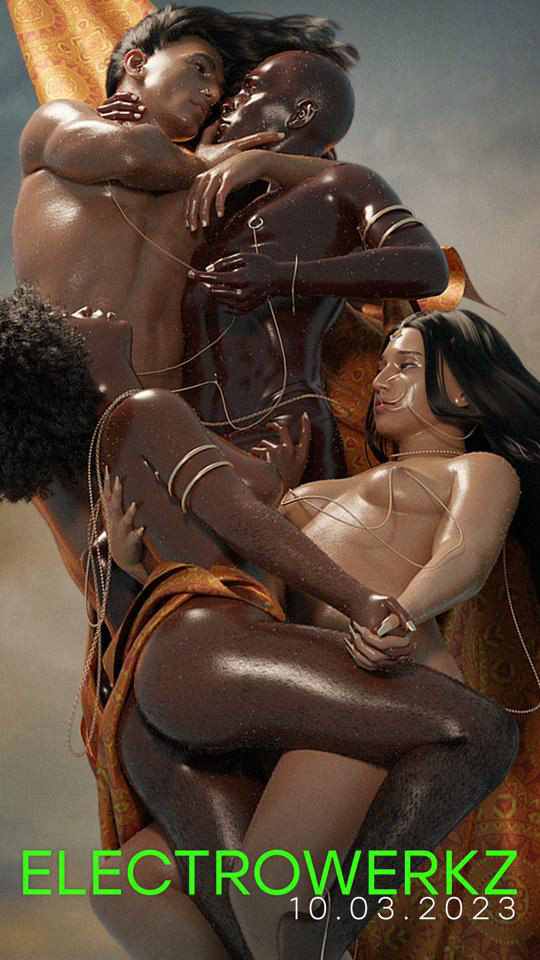
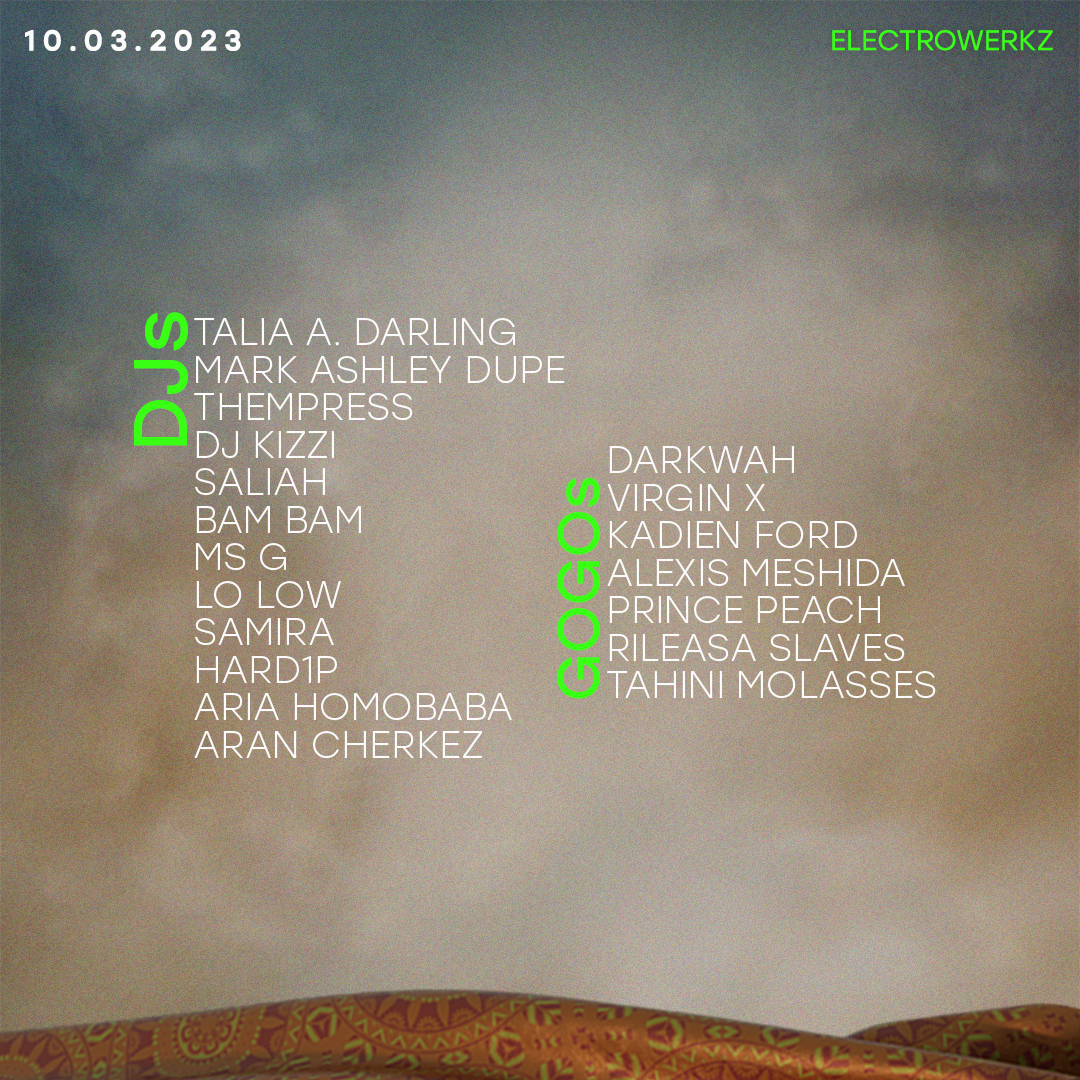
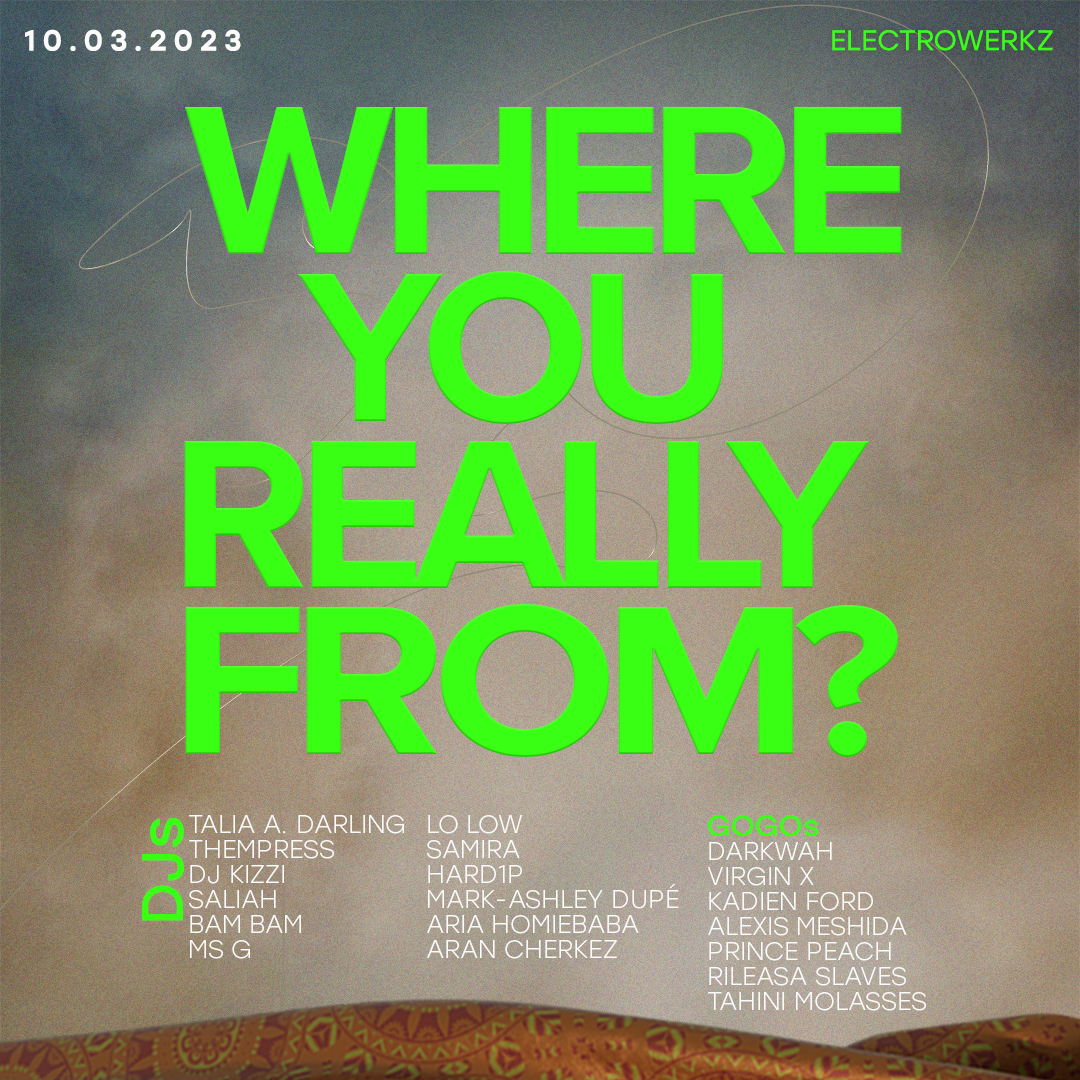
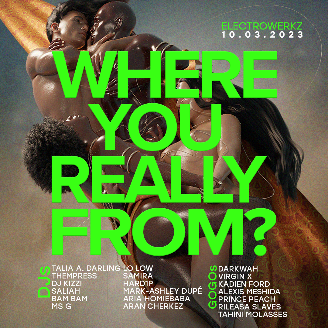
CLUB NIGHT: BRANDING / GRAPHIC DESIGN
Where you really from? is a party which centres QTPOC guests, DJs and dancers. I worked with a 3d artist to produce the main image, then came up with the branding and graphic design.
INSTAGRAM TEASERS
'Save the date' instagram posts and stories for use before the artists had been confirmed.

INSTAGRAM CAROUSEL

INSTAGRAM POSTS


INSTAGRAM STORIES


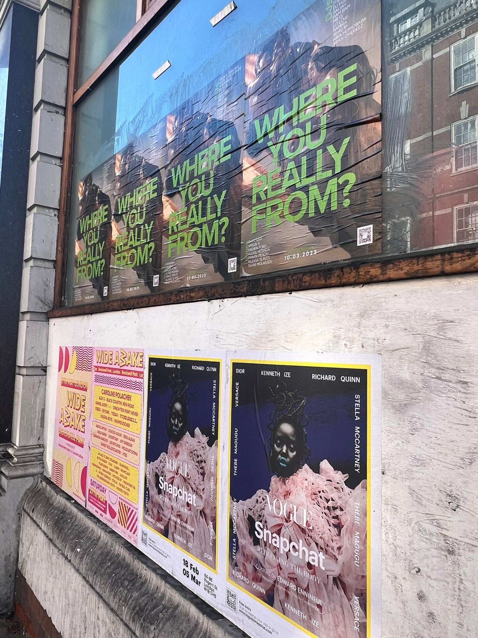
POSTERS
The posters were printed at A1 size and were put up around East London and Soho.
FLYERS

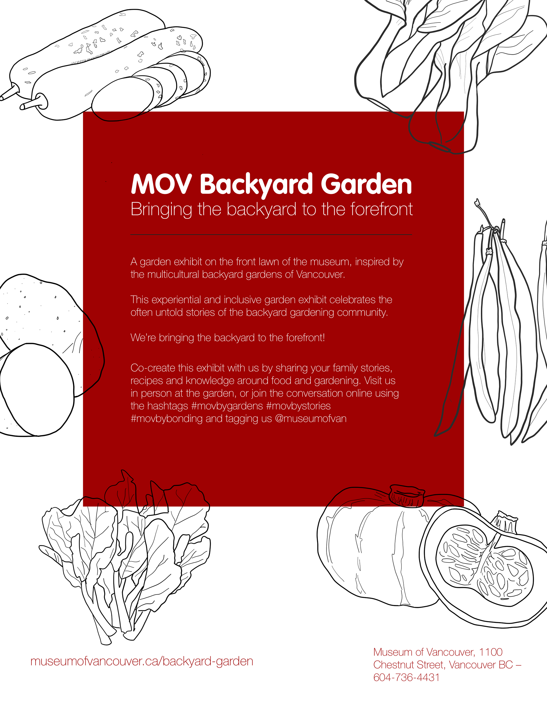
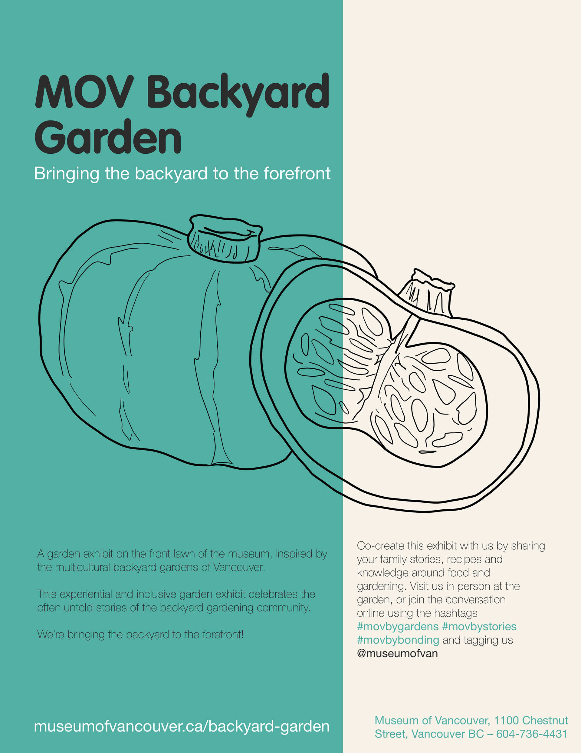
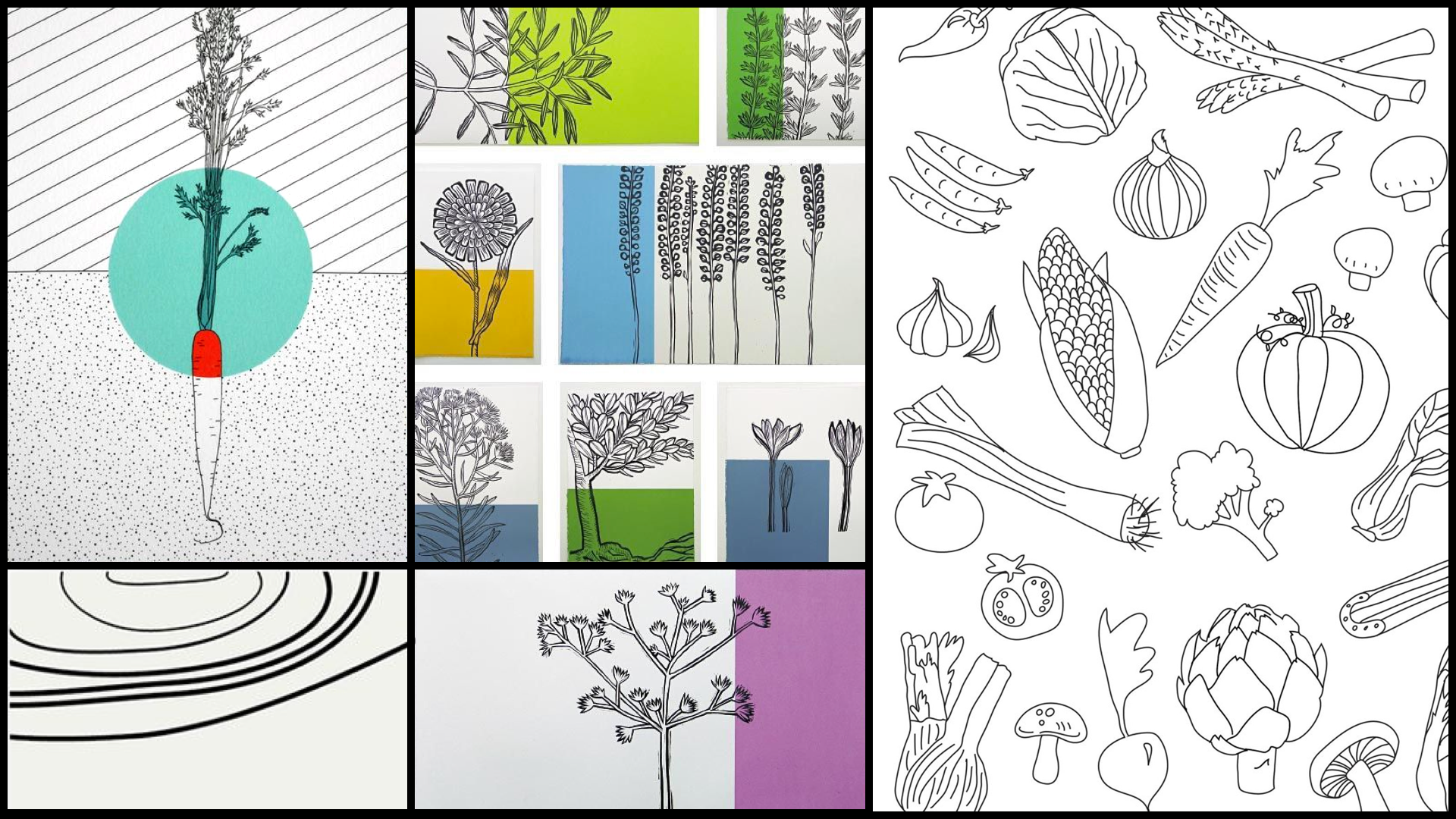
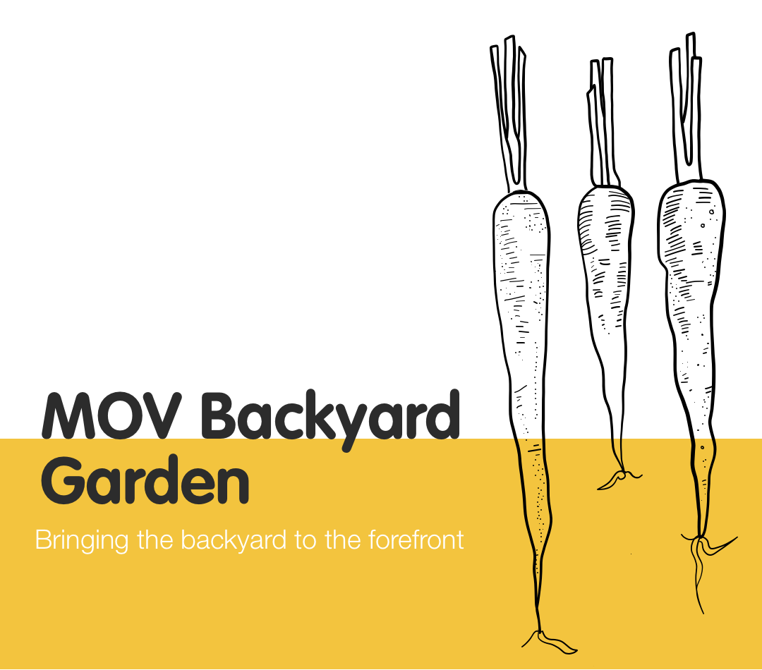
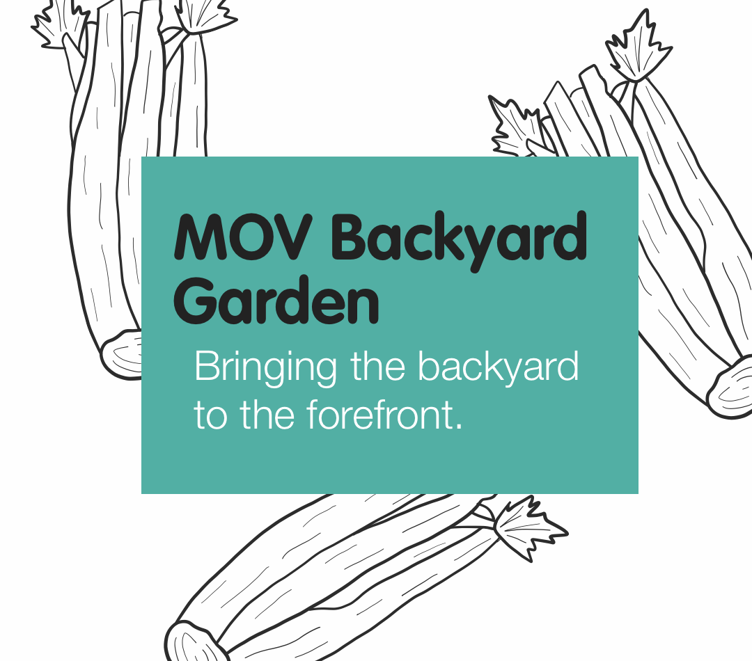
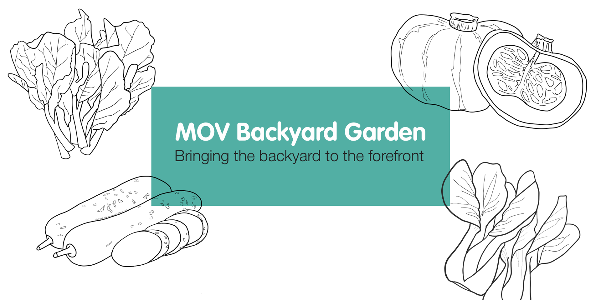
MUSEM OF VANCOUVER.
SOCIAL MEDIA MARKETING CAMPAIGN: BRANDING / ILLUSTRATION / GRAPHIC DESIGN
The Museum of Vancouver, in partnership with the University of British Columbia, created a garden exhibit on the front lawn of the museum that is inspired by the multicultural backyard gardens of Vancouver.
I was tasked with creating a brand and marketing collateral for the project.
REQUIREMENTS
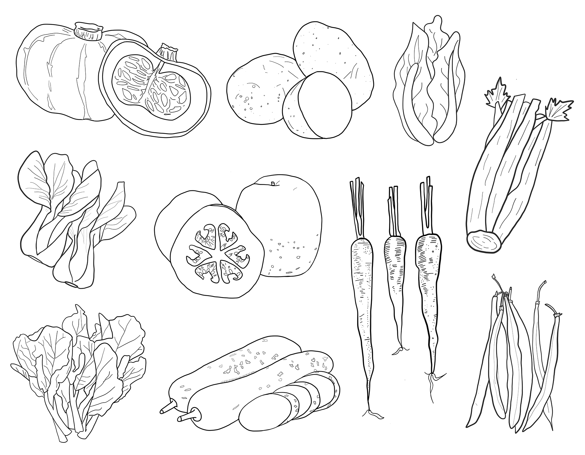
As the garden will represent the different cultures of Vancouver, it was a requirement to incorporate Chinese vegetables and an Asian inspired colour palette. The design must also fit in with the existing Museum of Vancouver brand.
MOOD BOARD
![]()
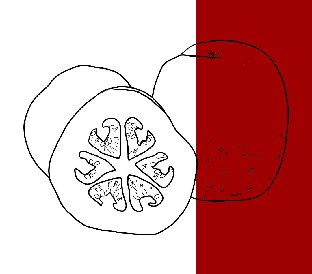
ILLUSTRATIONS
![]()
INSTAGRAM
![]()
![]()
![]()
![]()
![]()
![]()
REQUIREMENTS
As the garden will represent the different cultures of Vancouver, it was a requirement to incorporate Chinese vegetables and an Asian inspired colour palette. The design must also fit in with the existing Museum of Vancouver brand.
MOOD BOARD
ILLUSTRATIONS
INSTAGRAM


FACEBOOK HEADERS


POSTERS