KOOTH SIGN-UP FLOW.
RESPONSIVE MENTAL WELLBEING WEBSITE: UX/UI
Kooth is an online wellbeing platform for young people. Their mission: "to create a welcoming space for effective personalised digital mental heath care. Available to all." Kooth want their service available to all but currently this is not the case, so I was tasked with making the start of the user journey - the sign-up flow - more inclusive. There were many limitations and unique considerations which made designing this flow a challenge.
WHO
Kooth is used by young people aged between 11 and 18 who are suffering from mental health issues. As the users may be in a heightened sense of distress, it is important the design and language are mindful of this.
PROCESS

Analysis of old sign-up flow

Proposed wireframes

User feedback analysis of wireframes

User feedback analysis of hi-fi designs
AN ACCESSIBLE DESIGN SYSTEM
There was not an existing design system at Kooth, so this was a great opportunity to build one which was accessible and worked with the existing brand.
ACCESS TO THE SIGN-UP FLOW
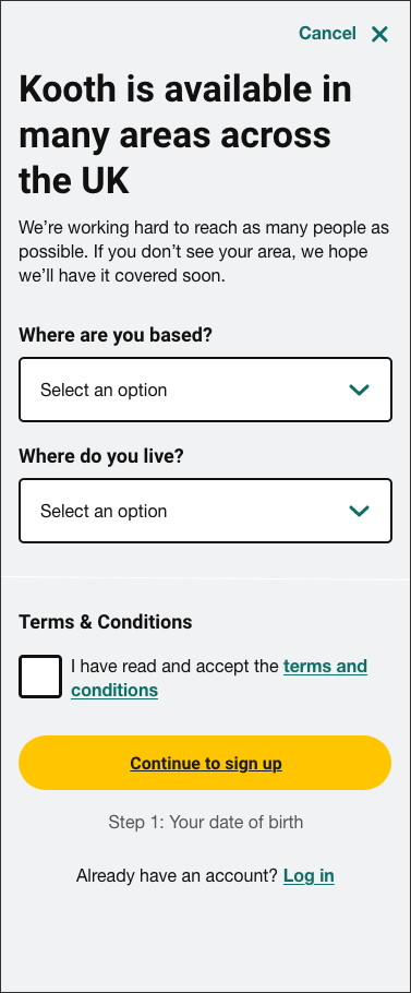
Kooth is only available to those in areas where the local government has paid. The previous sign-up form asked where a user was based, but not all areas in the UK were listed due to this constraint; this created a lot of confusion. The step was amended to make this more clear:

ASKING ABOUT GENDER
In an ideal world, we would not need to ask people for personal information. However, Kooth uses this information to feed into the government Mental Health Services Data Set which is used to help shape their services.
As some users are at the time of their lives where they may be unsure or uncomfortable sharing this information, it was important to be transparent about why this was being asked.
Due to safe-guarding concerns the sign-up form cannot include any open text fields, so the options chosen needed to allow for an ever-evolving gender spectrum.


CAPTURING ETHNICITY
The previous sign-up form used the national standard options which were white-centric and not inclusive. To be truly inclusive the list would have been extremely long, so landing on a set of options without the option to write your own was extremely challenging.
The options that were landed on are by no means perfect, but I felt they were a step in the right direction. User testing also suggested the selection of options made new users feel safe and that Kooth was an inclusive space.

CREATING A USERNAME
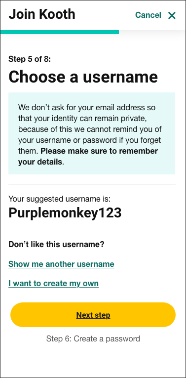
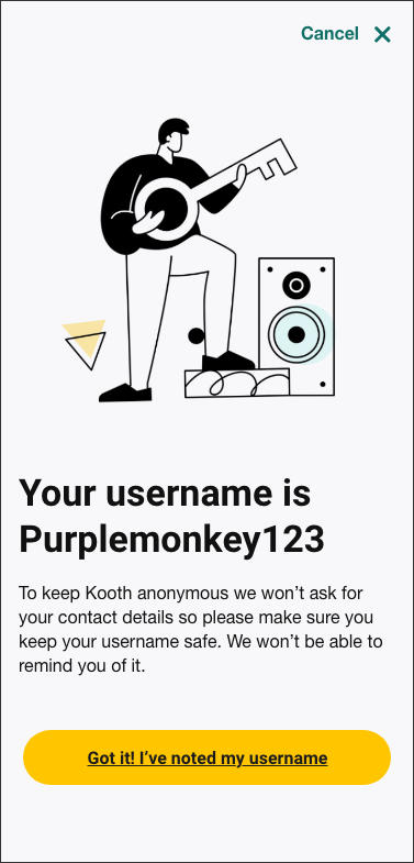
When capturing username there are a few limitations that had to be considered. Due to the sensitive nature of the service, usernames cannot be personal, all free text needs to be approved and we cannot take the user's email address. This also means we cannot remind people of their username at a later stage so have to emphasise the importance of remembering it.
The solution was to provide a database of pre-approved usernames but this would need extra emphasis on having to remember it. The option to create your own was kept as back-up for those users who like to express themselves through their online pseudonym.


REVIEW DETAILS PAGE
As contact details are not stored Kooth are unable to reminder users of their details or change them later. The introduction of a summary page was designed to help alleviate the number of abandoned accounts.
